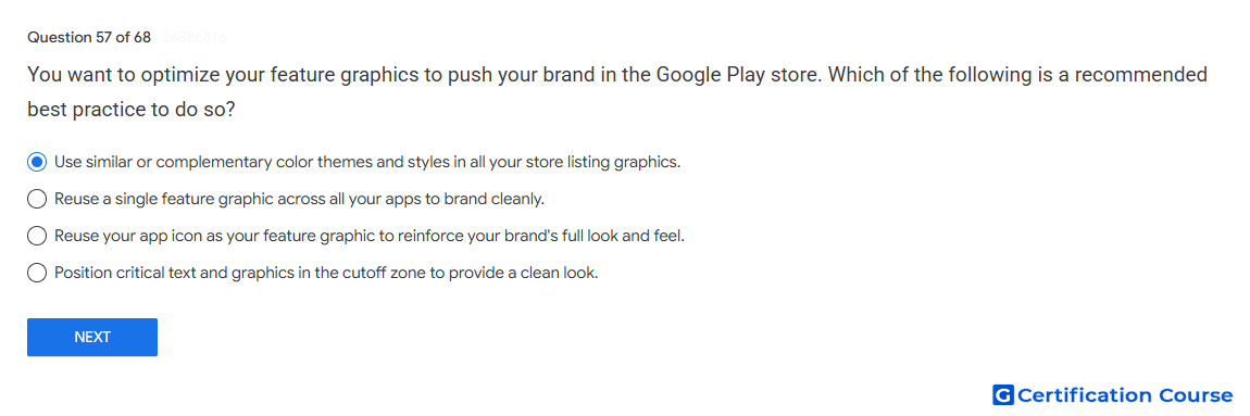
Question: You want to optimize your feature graphics to push your brand in the Google Play store. Which of the following is a recommended best practice to do so?
- Use similar or complementary color themes and styles in all your store listing graphics.
- Reuse a single feature graphic across all your apps to brand cleanly.
- Reuse your app icon as your feature graphic to reinforce your brand's full look and feel.
- Position critical text and graphics in the cutoff zone to provide a clean look.
Explanation
A feature graphic should visually support the app’s brand while staying consistent with other store listing assets. Google Play recommends using a cohesive visual style across graphics so users can recognize the app experience clearly. The asset should highlight the app or game experience rather than duplicate another required asset. Important visual elements should remain inside safe areas so they are not cropped on different surfaces.
Why the other options are incorrect
Single reused graphic Reusing the same feature graphic across different apps can make listings less specific and less useful.
App icon reuse A feature graphic should not simply duplicate the app icon because it serves a different store listing purpose.
Cutoff zone Critical text or imagery should not be placed where it may be cropped.
Source for verification
https://support.google.com/googleplay/android-developer/answer/9866151
The answer(s) to the question is highlighted in the BOLD text above. You can also find more questions and answers related to the exams on the "Google Play Store Listing" page.