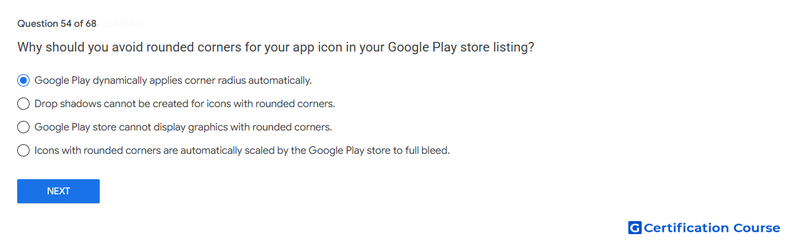
Question: Why should you avoid rounded corners for your app icon in your Google Play store listing?
- Google Play dynamically applies corner radius automatically.
- Drop shadows cannot be created for icons with rounded corners.
- Google Play store cannot display graphics with rounded corners.
- Icons with rounded corners are automatically scaled by the Google Play store to full bleed.
Explanation
Google Play applies corner radius dynamically to the final app icon. The uploaded app icon should remain a full square asset so Google Play can render it consistently across different UI layouts. Manually rounding the icon can cause inconsistent appearance when the system applies its own mask. This guidance also helps prevent key artwork from being clipped or distorted.
Why the other options are incorrect
Drop shadows Google Play can apply visual treatment independently of whether the uploaded asset has rounded corners.
Cannot display rounded corners Google Play can display rounded corners because it applies them automatically.
Full bleed scaling Google Play does not automatically scale rounded-corner icons to full bleed as the reason for avoiding them.
Source for verification
https://developer.android.com/distribute/google-play/resources/icon-design-specifications
The answer(s) to the question is highlighted in the BOLD text above. You can also find more questions and answers related to the exams on the "Google Play Store Listing" page.