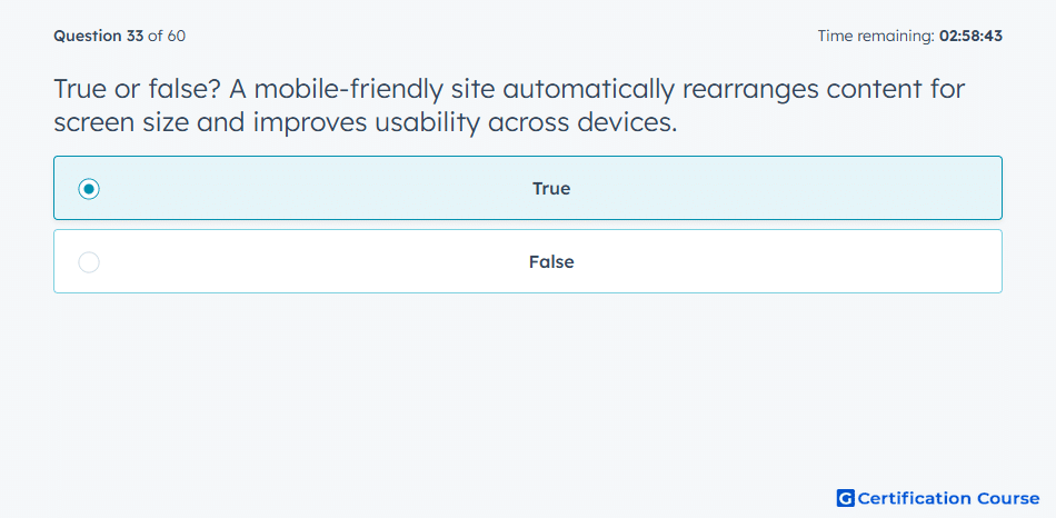
Question: True or false? A mobile-friendly site automatically rearranges content for screen size and improves usability across devices.
- True
- False
Explanation
A mobile-friendly experience depends on responsive content that adjusts to the device where it is viewed. HubSpot’s template layouts are designed to automatically adapt to different screen sizes. This improves usability because visitors can read, navigate, and interact with content without unnecessary friction. Mobile optimization supports a consistent experience across desktop, tablet, and phone.
Why the other options are incorrect
False is incorrect because responsive content is specifically designed to adjust for different screen sizes.
Source for verification
https://knowledge.hubspot.com/design-manager/a-quick-tour-of-the-design-manager
The answer(s) to the question is highlighted in the BOLD text above. You can also find more questions and answers related to the exams on the "HubSpot Digital Marketing Course" page.