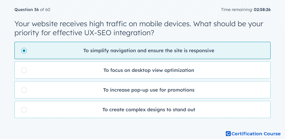
Question: Your website receives high traffic on mobile devices. What should be your priority for effective UX-SEO integration?
- To simplify navigation and ensure the site is responsive
- To focus on desktop view optimization
- To increase pop-up use for promotions
- To create complex designs to stand out
Explanation
Mobile-heavy traffic makes responsive design essential because page content needs to adapt cleanly across device sizes. Clear navigation helps visitors find relevant information quickly, which supports both usability and engagement. HubSpot’s mobile editing tools help refine how drag-and-drop content appears on smaller screens. Strong UX-SEO alignment depends on reducing friction while keeping pages accessible and easy to use.
Why the other options are incorrect
Desktop view optimization ignores the main device behavior shown by the traffic data.
Pop-up use can interrupt navigation and create friction on smaller screens.
Complex designs can slow the experience and make mobile interaction harder.
Source for verification
https://knowledge.hubspot.com/seo/view-seo-recommendations-in-hubspot
The answer(s) to the question is highlighted in the BOLD text above. You can also find more questions and answers related to the exams on the "HubSpot Digital Marketing Course" page.