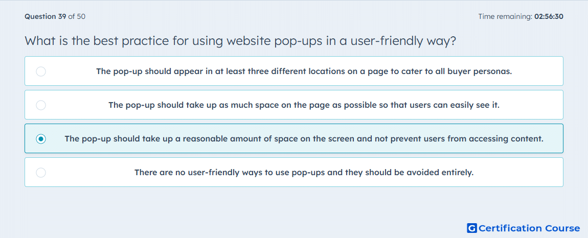
Question: What is the best practice for using website pop-ups in a user-friendly way?
- The pop-up should appear in at least three different locations on a page to cater to all buyer personas.
- The pop-up should take up as much space on the page as possible so that users can easily see it.
- The pop-up should take up a reasonable amount of space on the screen and not prevent users from accessing content.
- There are no user-friendly ways to use pop-ups and they should be avoided entirely.
Explanation
A user-friendly pop-up should occupy a reasonable portion of the screen without obstructing access to the main content. This approach complies with intrusive interstitial guidelines, improving Page Experience. Properly designed pop-ups maintain engagement while avoiding penalties from search engines. Balancing visibility with unobtrusiveness enhances both user experience and SEO performance.
Why the other options are incorrect
A) Multiple pop-ups overwhelm users and violate intrusive interstitial best practices.
B) Large pop-ups block content and harm user experience.
D) Pop-ups can be used effectively if designed thoughtfully; they are not prohibited.
Source for verification
HubSpot Academy: Core Web Vitals and Page Experience
The answer(s) to the question is highlighted in the BOLD text above. You can also find more questions and answers related to the exams on the "HubSpot SEO II" page.