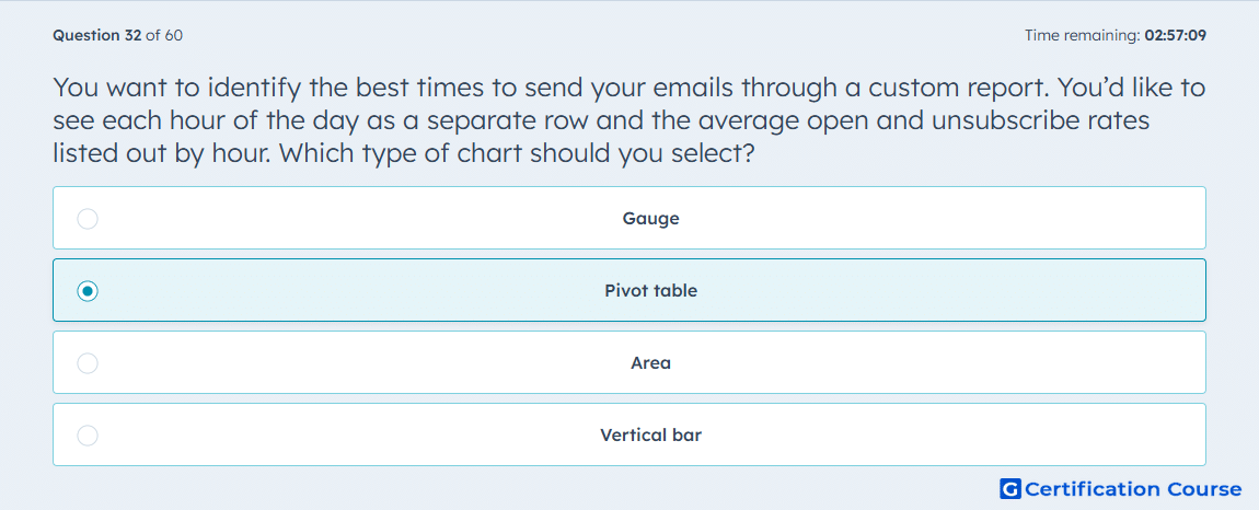
Question: You want to identify the best times to send your emails through a custom report. You’d like to see each hour of the day as a separate row and the average open and unsubscribe rates listed out by hour. Which type of chart should you select?
- Gauge
- Pivot table
- Area
- Vertical bar
Explanation
A pivot table is used when report data needs to be displayed in rows with metric values broken out by category. In this case, each hour of day can appear as a separate row. Average open rate and unsubscribe rate can then be shown as separate measured values for each hour. This chart type is best suited for comparing multiple email performance metrics across time-based groupings.
Why the other options are incorrect
Gauge shows progress toward a single value, not hourly rows with multiple metrics.
Area visualizes trends over time, but it does not list each hour as a separate row.
Vertical bar compares values visually, but it is not designed for row-based metric tables.
Source for verification
https://knowledge.hubspot.com/marketing-email/create-a-custom-marketing-email-report
The answer(s) to the question is highlighted in the BOLD text above. You can also find more questions and answers related to the exams on the "HubSpot Email Marketing Software" page.