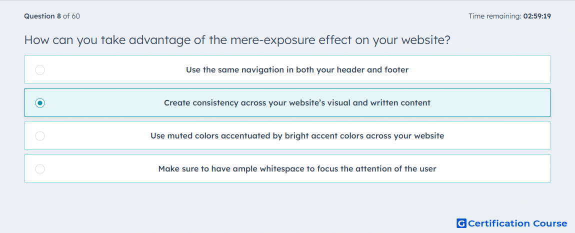
Question: How can you take advantage of the mere-exposure effect on your website?
- Use the same navigation in both your header and footer
- Create consistency across your website’s visual and written content
- Use muted colors accentuated by bright accent colors across your website
- Make sure to have ample whitespace to focus the attention of the user
Explanation
The mere-exposure effect is the principle that people tend to prefer what feels familiar. HubSpot applies this idea to website user experience by recommending repeated patterns across layout, typography, color, and messaging so visitors do not have to re-learn the interface from page to page. That consistency makes the site feel more predictable and easier to process, which supports a smoother experience. HubSpot also recommends maintaining both a visual style guide and a written style guide so that familiarity is reinforced across the whole site. HubSpot+1
Why the other options are incorrect
A) Repeating navigation in more than one location can help usability, but HubSpot connects the mere-exposure effect to broader consistency across the site, not to one navigation placement choice alone. HubSpot
C) Accent-color strategy is presented by HubSpot as part of visual appeal and brand usability, not as the direct mechanism for the mere-exposure effect. HubSpot
D) Whitespace is used to frame important information and guide focus, which supports appeal and clarity rather than familiarity through repeated patterns. HubSpot
Source for verification
The answer(s) to the question is highlighted in the BOLD text above. You can also find more questions and answers related to the exams on the "HubSpot Content Hub For Marketers" page.