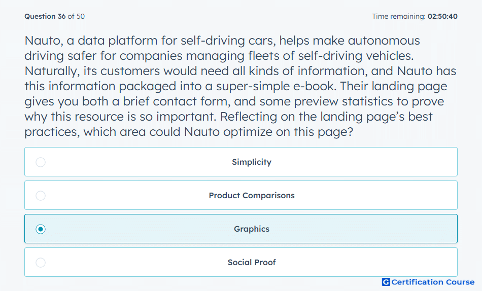
Question: Nauto, a data platform for self-driving cars, helps make autonomous driving safer for companies managing fleets of self-driving vehicles. Naturally, its customers would need all kinds of information, and Nauto has this information packaged into a super-simple e-book. Their landing page gives you both a brief contact form, and some preview statistics to prove why this resource is so important. Reflecting on the landing page’s best practices, which area could Nauto optimize on this page?
- Simplicity
- Product Comparisons
- Graphics
- Social Proof
Explanation
A strong landing page should use visual elements that reinforce the offer and make the value easier to understand. Preview statistics can support credibility, but the page can be improved when visuals make the content more engaging and easier to scan. Graphics should guide attention toward the offer without distracting from the form or conversion goal. In HubSpot’s optimization approach, page elements should reduce friction and help visitors quickly understand the value of taking action.
Why the other options are incorrect
Simplicity is incorrect because the page already uses a brief form and a focused offer.
Product Comparisons is incorrect because the offer is an educational resource, not a comparison-focused buying page.
Social Proof is incorrect because preview statistics already help support credibility.
Source for verification
https://knowledge.hubspot.com/landing-pages/create-and-customize-pages-BETA
The answer(s) to the question is highlighted in the BOLD text above. You can also find more questions and answers related to the exams on the "HubSpot Inbound Marketing Optimization" page.