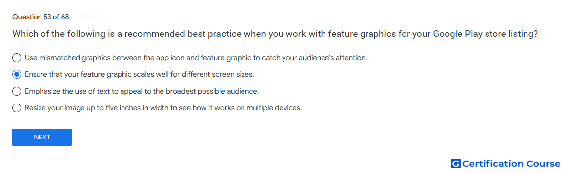
Question: Which of the following is a recommended best practice when you work with feature graphics for your Google Play store listing?
- Use mismatched graphics between the app icon and feature graphic to catch your audience's attention.
- Ensure that your feature graphic scales well for different screen sizes.
- Emphasize the use of text to appeal to the broadest possible audience.
- Resize your image up to five inches in width to see how it works on multiple devices.
Explanation
A feature graphic should be designed for scale so it displays well across different Google Play surfaces and screen sizes. Google Play recommends keeping important visual elements near the center of graphics. This reduces the risk that key content will be cropped or unclear in different placements. The graphic should support the app or game experience while remaining consistent with other store listing assets.
Why the other options are incorrect
Mismatched graphics Inconsistent visuals can weaken the store listing experience and confuse users.
Emphasize text Google Play recommends minimizing text in feature graphic assets.
Five inches Google Play asset guidance is based on pixels and scalable design, not physical inch measurements.
Source for verification
https://support.google.com/googleplay/android-developer/answer/13393723
The answer(s) to the question is highlighted in the BOLD text above. You can also find more questions and answers related to the exams on the "Google Play Store Listing" page.