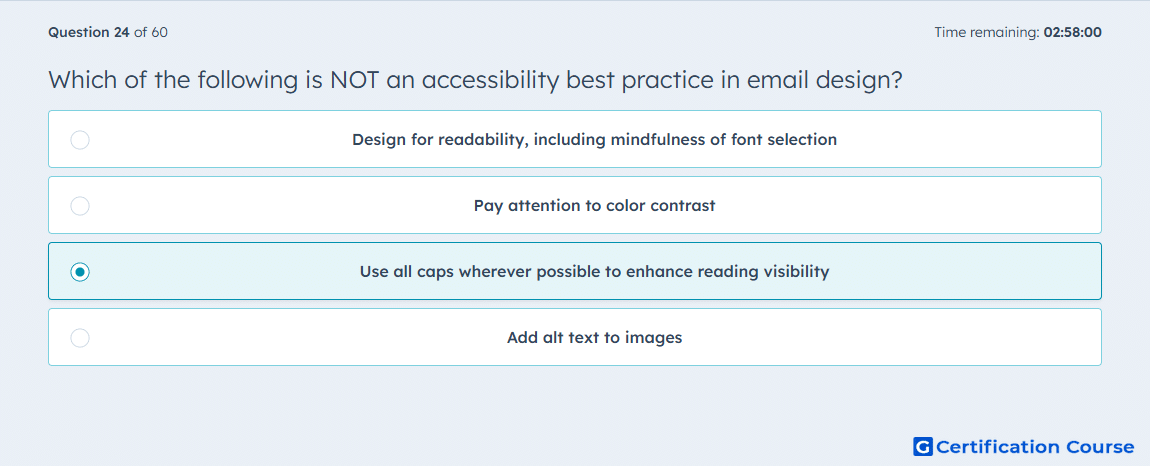
Question: Which of the following is NOT an accessibility best practice in email design?
- Design for readability, including mindfulness of font selection
- Pay attention to color contrast
- Use all caps wherever possible to enhance reading visibility
- Add alt text to images
Explanation
Using all caps across email content can make text harder to scan and understand. Accessible marketing email design should prioritize readability, clear formatting, and content that works for different users and devices. HubSpot content tools support accessibility needs through features such as alt text for images. Strong email design avoids visual choices that reduce comprehension or create unnecessary reading friction.
Why the other options are incorrect
Readability is incorrect because font choice and readable formatting support accessible email content.
Color contrast is incorrect because sufficient contrast helps contacts read and understand the message.
Alt text is incorrect because image descriptions support contacts who use assistive technology or have images blocked.
Source for verification
https://knowledge.hubspot.com/marketing-email/create-and-send-marketing-emails
https://knowledge.hubspot.com/website-pages/use-images-in-hubspot-content
The answer(s) to the question is highlighted in the BOLD text above. You can also find more questions and answers related to the exams on the "HubSpot Email Marketing" page.