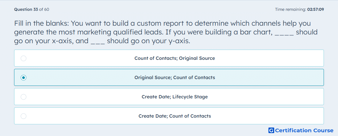
Question: Fill in the blanks: You want to build a custom report to determine which channels help you generate the most marketing qualified leads. If you were building a bar chart, ____ should go on your x-axis, and ___ should go on your y-axis.
- Count of Contacts; Original Source
- Original Source; Count of Contacts
- Create Date; Lifecycle Stage
- Create Date; Count of Contacts
Explanation
In a bar chart analyzing marketing qualified leads, Original Source should be on the x-axis to categorize leads by the channel that generated them. Count of Contacts goes on the y-axis to measure the volume of leads per source. In HubSpot, this setup provides a clear comparison of which channels contribute most to lead generation. It ensures data is aggregated and visualized effectively for decision-making on marketing performance.
Why the other options are incorrect
Option A reverses axes, making it harder to interpret sources.
Option C uses dates and lifecycle stages, which do not measure lead generation by channel.
Option D plots count by create date, showing volume over time rather than by source.
Source for verification
The answer(s) to the question is highlighted in the BOLD text above. You can also find more questions and answers related to the exams on the "HubSpot Reporting" page.