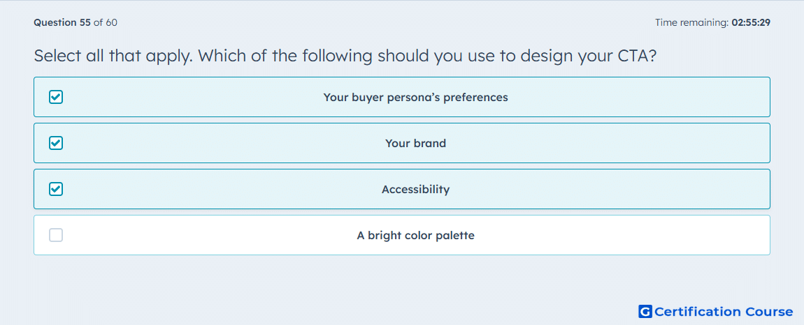
Question: Select all that apply. Which of the following should you use to design your CTA?
- Your buyer persona’s preferences
- Your brand
- Accessibility
- A bright color palette
Explanation
Designing a CTA should start with your buyer persona because HubSpot supports smart content in CTAs, which lets the message adapt to different audience criteria. Brand alignment also matters because HubSpot’s CTA tool includes styling controls, so the CTA should stay visually consistent with the rest of the experience. Accessibility must be considered as well, since HubSpot’s content guidance emphasizes accessibility practices such as descriptive alt text for screen readers. A bright palette by itself is not the standard, because effectiveness depends on audience fit, brand consistency, and accessibility rather than brightness alone. HubSpot Knowledge Base+2HubSpot Knowledge Base+2
Why the other options are incorrect
A bright color palette Bright colors are not automatically effective in HubSpot, because CTA design should be guided by the buyer persona, the brand, and accessibility requirements instead of color intensity alone. HubSpot Knowledge Base+2HubSpot Knowledge Base+2
Source for verification
https://knowledge.hubspot.com/ctas/create-calls-to-action
https://knowledge.hubspot.com/ctas/add-smart-content-to-your-ctas
The answer(s) to the question is highlighted in the BOLD text above. You can also find more questions and answers related to the exams on the "HubSpot Marketing Hub Software Certification" page.