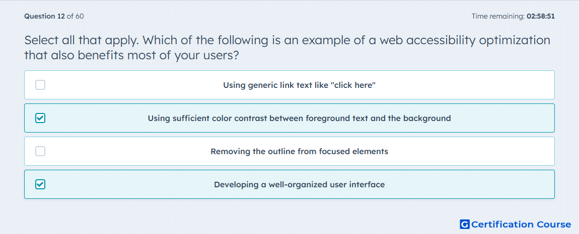
Question: Select all that apply. Which of the following is an example of a web accessibility optimization that also benefits most of your users?
- Using generic link text like "click here"
- Using sufficient color contrast between foreground text and the background
- Removing the outline from focused elements
- Developing a well-organized user interface
Explanation
This fits WCAG best practice because sufficient color contrast makes text easier to read for people with limited vision while also improving readability for the broader audience. HubSpot explicitly recommends maintaining enough contrast between text and background as part of accessible design. A well-organized interface also benefits most users because clear structure, semantic regions, and predictable navigation improve general usability in addition to accessibility. HubSpot notes that accessibility improvements often strengthen user experience and other site quality goals at the same time. HubSpot Developers
Why the other options are incorrect
A) Using generic link text like "click here" is discouraged because it lacks descriptive meaning and weakens both accessibility and general clarity. HubSpot Developers
C) Removing the outline from focused elements is incorrect because HubSpot says :focus must remain visually identifiable unless an acceptable alternate indicator is provided. HubSpot Developers
Source for verification
HubSpot Developer Documentation: Accessibility HubSpot Developers
The answer(s) to the question is highlighted in the BOLD text above. You can also find more questions and answers related to the exams on the "HubSpot CMS for Developers II" page.