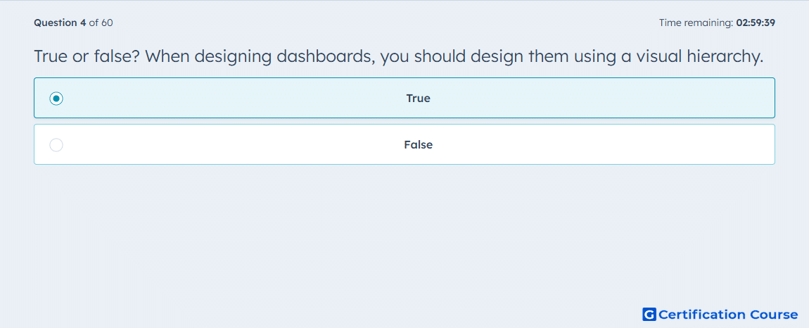
Question: True or false? When designing dashboards, you should design them using a visual hierarchy.
- True
- False
Explanation
Dashboards should be designed using a visual hierarchy to prioritize key metrics and guide viewers’ attention to the most important data first. In HubSpot, applying visual hierarchy improves readability and ensures stakeholders can quickly interpret performance trends. This approach organizes charts and reports logically, grouping related information and emphasizing critical KPIs. A well-structured hierarchy enhances actionable insights and reduces cognitive load for users.
Why the other options are incorrect
False is incorrect because dashboards without visual hierarchy can be confusing and obscure important metrics.
Source for verification
HubSpot Dashboards
The answer(s) to the question is highlighted in the BOLD text above. You can also find more questions and answers related to the exams on the "HubSpot Reporting" page.