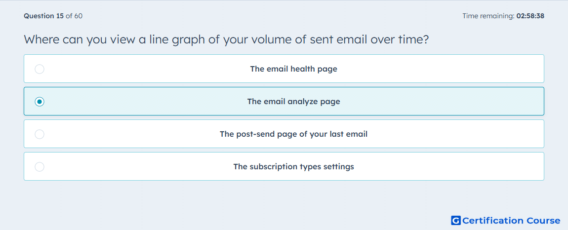
Question: Where can you view a line graph of your volume of sent email over time?
- The email health page
- The email analyze page
- The post-send page of your last email
- The subscription types settings
Explanation
HubSpot’s Analyze page is where marketing email performance trends are reviewed across a selected date range. It includes a line graph that shows sent email volume over time. This view is designed for aggregate performance analysis rather than details for a single sent email. The graph supports evaluating broader sending patterns from the marketing email tool.
Why the other options are incorrect
The email health page focuses on deliverability and email health metrics, not the sent-volume line graph.
The post-send page shows performance for an individual sent email, not overall sent volume over time.
The subscription types settings manage email communication preferences, not marketing email reporting.
Source for verification
https://knowledge.hubspot.com/marketing-email/analyze-your-marketing-email-campaign-performance
The answer(s) to the question is highlighted in the BOLD text above. You can also find more questions and answers related to the exams on the "HubSpot Email Marketing Software" page.