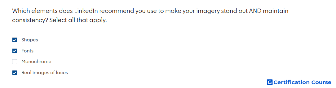
Question: Which elements does LinkedIn recommend you use to make your imagery stand out AND maintain consistency? Select all that apply.
- Fonts
- Shapes
- Monochrome
- Real images of faces
Explanation
LinkedIn creative guidance emphasizes using recognizable brand identity elements so visual assets feel consistent across posts and campaigns. Fonts and shapes help create a repeatable design system that makes content easier to recognize in the feed. Real images of faces support authenticity and help creative feel more human and relatable. Monochrome can be a visual style, but it does not provide the same flexible consistency and attention value as these recommended creative elements.
Why the other options are incorrect
Monochrome limits visual variety and is not the recommended element for balancing standout imagery with consistent branding.
Source for verification
https://www.linkedin.com/help/lms/answer/a420488
The answer(s) to the question is highlighted in the BOLD text above. You can also find more questions and answers related to the exams on the "LinkedIn Content and Creative Design" page.