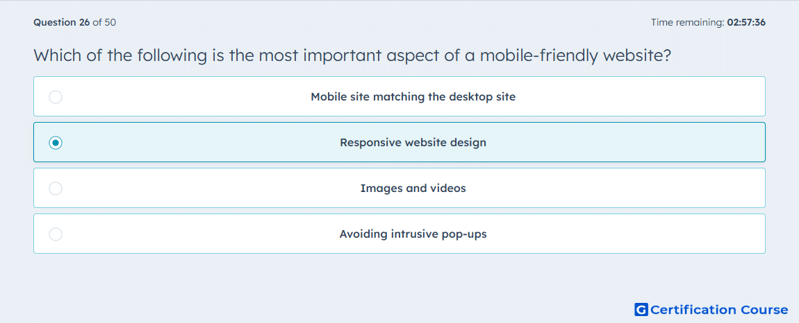
Question: Which of the following is the most important aspect of a mobile-friendly website?
- Mobile site matching the desktop site
- Responsive website design
- Images and videos
- Avoiding intrusive pop-ups
Explanation
Responsive website design ensures that a site automatically adjusts layout and content to fit different screen sizes and devices. This provides a consistent user experience, improves mobile usability, and aligns with Google’s mobile-first indexing. Responsive design supports crawlability and engagement metrics, both of which influence search rankings. It is the foundational element of a mobile-friendly site.
Why the other options are incorrect
A) Matching the desktop site does not guarantee usability across all devices.
C) Images and videos are important but secondary to overall responsive layout.
D) Avoiding intrusive pop-ups improves experience but is not the core requirement for mobile-friendliness.
Source for verification
HubSpot Academy: Technical SEO Audit
The answer(s) to the question is highlighted in the BOLD text above. You can also find more questions and answers related to the exams on the "HubSpot SEO II" page.