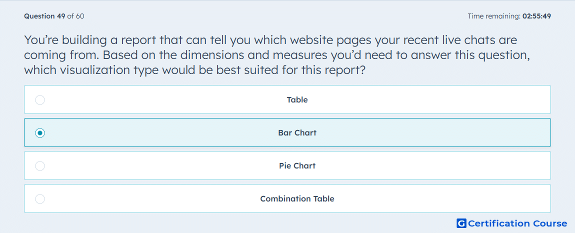
Question: You’re building a report that can tell you which website pages your recent live chats are coming from. Based on the dimensions and measures you’d need to answer this question, which visualization type would be best suited for this report?
- Table
- Bar Chart
- Pie Chart
- Combination Table
Explanation
A bar chart is ideal for showing the number of live chats coming from each website page because it allows easy comparison across multiple pages. The x-axis can represent individual pages, while the y-axis shows the volume of chats per page. In HubSpot, this visualization highlights top-performing pages for chat engagement and quickly identifies where visitors are initiating conversations. Bar charts provide a clear, visual ranking of pages by activity without overwhelming the viewer with raw data.
Why the other options are incorrect
Table lists data but does not provide an immediate visual comparison.
Pie chart is less effective for many categories, making it hard to compare multiple pages.
Combination table is unnecessary unless combining multiple metrics and dimensions beyond this use case.
Source for verification
The answer(s) to the question is highlighted in the BOLD text above. You can also find more questions and answers related to the exams on the "HubSpot Reporting" page.