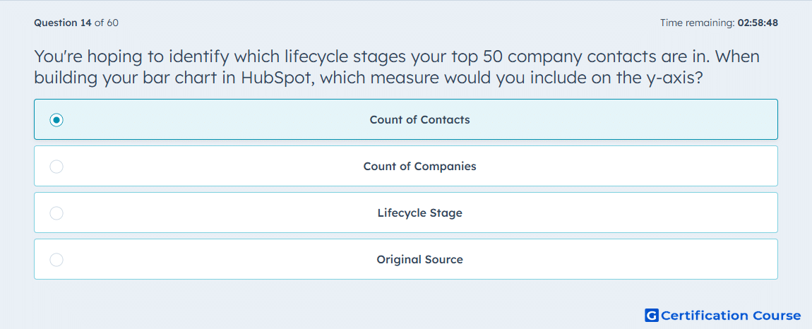
Question: You're hoping to identify which lifecycle stages your top 50 company contacts are in. When building your bar chart in HubSpot, which measure would you include on the y-axis?
- Count of Contacts
- Count of Companies
- Lifecycle Stage
- Original Source
Explanation
For a bar chart showing lifecycle stages of the top 50 company contacts, the Count of Contacts measure should be on the y-axis. This quantifies how many contacts fall into each lifecycle stage, allowing comparison across stages. In HubSpot, this setup provides clear visualization of contact distribution within companies and supports segmentation and pipeline analysis. Using count ensures that each contact is represented in the aggregation accurately.
Why the other options are incorrect
Count of Companies tracks organizations, not individual contact distribution.
Lifecycle Stage is a dimension, not a numeric measure for the y-axis.
Original Source categorizes traffic origins, unrelated to lifecycle counts.
Source for verification
The answer(s) to the question is highlighted in the BOLD text above. You can also find more questions and answers related to the exams on the "HubSpot Reporting" page.