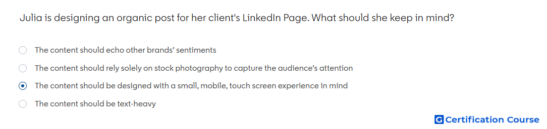
Question: Julia is designing an organic post for her client's LinkedIn Page. What should she keep in mind?
- The content should be designed with a small, mobile, touch screen experience in mind
- The content should rely solely on stock photography to capture the audience’s attention
- The content should be text-heavy
- The content should echo other brands’ sentiments
Explanation
LinkedIn creative guidance recommends designing content for the way members actually consume feed content, especially on mobile devices. A strong LinkedIn Page post should be easy to read, visually clear, and simple to interact with on a small screen. Mobile-first design helps keep imagery, copy, and layout understandable without extra effort. This supports better organic engagement because the message can be processed quickly in the feed.
Why the other options are incorrect
Stock photography is incorrect because creative should not rely solely on stock visuals without brand customization or relevance.
Text-heavy is incorrect because dense copy is harder to consume quickly on mobile feeds.
Echo other brands’ sentiments is incorrect because LinkedIn content should reflect the company’s own voice, audience needs, and brand identity.
Source for verification
https://www.linkedin.com/help/lms/answer/a420488
The answer(s) to the question is highlighted in the BOLD text above. You can also find more questions and answers related to the exams on the "LinkedIn Content and Creative Design" page.