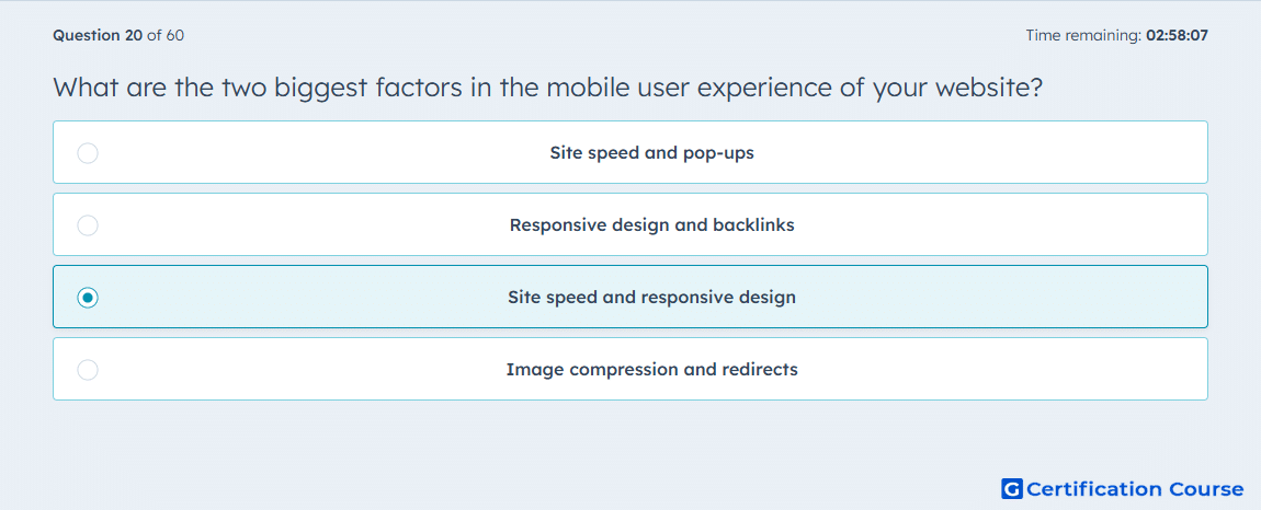
Question: What are the two biggest factors in the mobile user experience of your website?
- Site speed and pop-ups
- Responsive design and backlinks
- Site speed and responsive design
- Image compression and redirects
Explanation
Site speed affects how quickly pages load on mobile devices, directly influencing user engagement and bounce rate. Responsive design ensures that content and layout adapt to different screen sizes, improving usability. Both factors are critical for a positive mobile user experience and for maintaining SEO performance on mobile-first indexing.
Why the other options are incorrect
Site speed and pop-ups ignores layout adaptability, which is essential for mobile usability.
Responsive design and backlinks neglects page load speed, a key mobile metric.
Image compression and redirects are technical optimizations but do not fully address mobile experience priorities.
Source for verification
https://knowledge.hubspot.com/seo/mobile-seoturn3search4
The answer(s) to the question is highlighted in the BOLD text above. You can also find more questions and answers related to the exams on the "HubSpot SEO Certification Course" page.