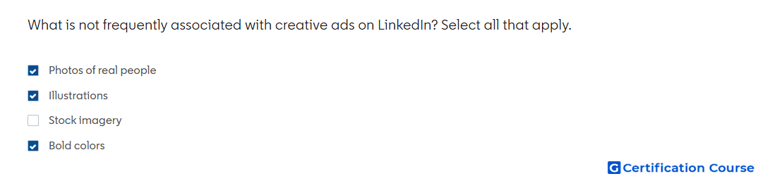
Question: What is not frequently associated with creative ads on LinkedIn? Select all that apply.
- Stock imagery
- Bold colors
- Illustrations
- Photos of real people
Explanation
LinkedIn creative guidance encourages using less common visual choices to make ads more distinctive in the feed. Bold color, illustration, and real human imagery can help improve attention because they differ from more standard ad visuals. Strong imagery supports faster recognition and can make the message easier to notice while scrolling. These choices should still align with the brand’s visual system and campaign objective.
Why the other options are incorrect
Stock imagery is incorrect because it is commonly associated with ad creative and is less distinctive unless customized.
Source for verification
https://www.linkedin.com/help/lms/answer/a420488
The answer(s) to the question is highlighted in the BOLD text above. You can also find more questions and answers related to the exams on the "LinkedIn Content and Creative Design" page.