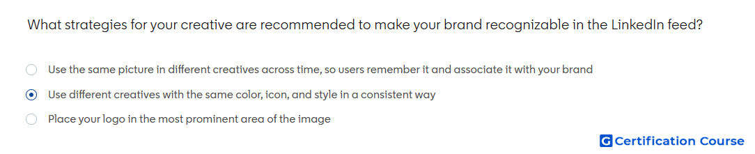
Question: What strategies for your creative are recommended to make your brand recognizable in the LinkedIn feed?
- Use different creatives with the same color, icon, and style in a consistent way
- Place your logo in the most prominent area of the image
- Use the same picture in different creatives across time, so users remember it and associate it with your brand
Explanation
LinkedIn creative guidance recommends building recognizable brand identity through consistent visual systems. Repeated use of colors, icons, fonts, and style helps audiences connect different creatives back to the same brand. This approach keeps the feed experience fresh while maintaining familiarity. Strong creative design should feel consistent without relying on one repeated image or an oversized logo.
Why the other options are incorrect
Prominent logo can make the creative feel crowded and does not replace a consistent visual system.
Same picture can create fatigue because recognition should come from consistent brand elements, not repeating one visual.
Source for verification
https://www.linkedin.com/help/lms/answer/a420488
The answer(s) to the question is highlighted in the BOLD text above. You can also find more questions and answers related to the exams on the "LinkedIn Content and Creative Design" page.