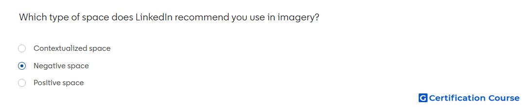
Question: Which type of space does LinkedIn recommend you use in imagery?
- Negative space
- Contextualized space
- Positive space
Explanation
LinkedIn creative guidance recommends using negative space so visual elements and copy have room to stand out. Open space makes the image easier to read, especially on mobile feeds. It also helps avoid clutter when adding short text, keywords, or brand elements to the creative. Strong imagery uses space intentionally so the message remains clear and immediately understandable.
Why the other options are incorrect
Contextualized space is not the recommended LinkedIn creative term for creating clean, readable visual layouts.
Positive space contains the main subject or design elements, but it does not provide the same clarity and breathing room as negative space.
Source for verification
https://www.linkedin.com/help/lms/answer/a420488
The answer(s) to the question is highlighted in the BOLD text above. You can also find more questions and answers related to the exams on the "LinkedIn Content and Creative Design" page.