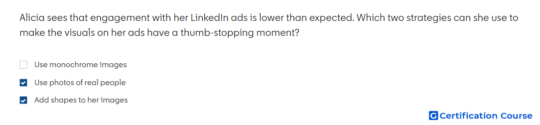
Question: Alicia sees that engagement with her LinkedIn ads is lower than expected. Which two strategies can she use to make the visuals on her ads have a thumb-stopping moment?
- Use photos of real people
- Add shapes to her images
- Use monochrome images
Explanation
LinkedIn creative guidance recommends using distinctive imagery to capture attention quickly in the feed. Photos of real people can make ads feel more human and noticeable during fast scrolling. Shapes can add contrast, structure, and visual energy to the creative. Strong creative design uses these elements to create a thumb-stopping moment without making the ad feel cluttered.
Why the other options are incorrect
Monochrome images are not the recommended tactic for creating stronger visual attention in LinkedIn ads.
Source for verification
https://www.linkedin.com/help/lms/answer/a420488
The answer(s) to the question is highlighted in the BOLD text above. You can also find more questions and answers related to the exams on the "LinkedIn Content and Creative Design" page.